Haverford College’s athletic department introduced its first official athletic-specific logo at the start of the 2012-2013 academic year.
For most of the College’s history there were as many variations on font, color combinations, nicknames and mascots as there were teams. Greg Kannerstein, former director of athletics who was eulogized as “Mr. Haverford” following his untimely passing in 2009 explained the athletic department’s nickname/mascot history best:
“Haverford was never the Fighting Quakers or the Quakers at all. Haverford teams were actually called the “Hornets” for some periods from the late 1930s to the late 1950s after being known more often as “The Red and Black” or “Scarlet and Black” up to the 1930s. “Fords” came in that 1930–1950s era too and eventually “Hornets” was used only by sportswriters and then by no one. In the 1970s, the student newspaper started calling the basketball team the “Red Wave” and then that term expanded to all HC teams, but never had official status.
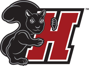
At this stage, “Fords” is the nickname and “Black Squirrel” is the mascot. They are different. A mascot dresses in a costume, runs around like an idiot, and is used as a logo for teams, has effigies made in its shape, etc. A nickname is a nickname, for cheers, newspaper stories, etc.
A lot of us think “Fords” is pretty silly, and of course it does not lend itself to representation as a mascot the way “Eagles,” “Wildcats,” etc. do for some colleges. Some players on the baseball team saw a lot of black squirrels (real ones, not mascots) in the area of the baseball field years ago. They attributed to the squirrels the characteristics of feistiness, distinctiveness, energy and determination they wanted as their own trademark. In the mid-1990s, the college actually made a decision: the official nickname would remain “Fords,” Haverford would adopt a mascot in the form of a Black Squirrel (and had a costume made up which, however, resembled a chipmunk) and teams would be free among themselves on campus to call themselves whatever they wanted, be it Squirrels, Hornets, Bees, Goats, etc. Public utterances of the institution must proclaim Fords as the nickname, but if a “Go, Squirrels” chant is heard from the sidelines, no one will be offended.”
Eager for consistency in identification across the department, Director of Athletics Wendy Smith ’87 initiated a lengthy collaborative process which included student-athletes, coaches, athletic adminstrators and representatives of the Communications Office. “I believe that our teams and student-athletes need to represent Haverford and our athletic program in a uniform manner. With the variety of H’s and other identifying marks across 23 varsity teams, one would not know by looking that our teams all represented the same institution. We are looking forward to phasing in the new marks and creating an identity that will more clearly promote our athletic program,” said Smith.
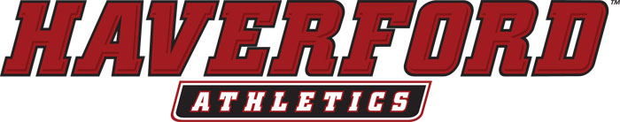
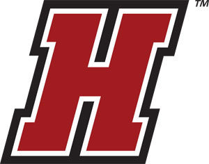
Phoenix Design Works, a professional marketing company in Maplewood, N.J., designed the branding marks for Haverford’s athletic teams. The primary logo is a word mark spelling out Haverford Athletics in the College’s colors. Two single-letter marks – one, a stand-alone “H” and the other, an “H” embraced by the Fords’ mascot, a Black Squirrel – complete the family of logos. Within these marks is the opportunity to create sport-specific marks for each of the 23 varsity teams.
|
|
|
|